We’ve made sure that you can easily and effectively tag the products in your online catalogs with hotspots, but how you do so remains up to you. You can choose the type of hotspot, set the size and placement of the click area, turn icons on or off, adjust the icon’s position, and write your own mouse-over texts. With so many options available, it can be tricky to figure out the best way to tag your products. To help you out, we wrote this best practice guide. It contains lots of useful tips and advice, so check it out!
Contents:
Here’s a short overview of the tips in this blog post. We’ve provided examples, reasoning, and how-tos for each tip.
- Use product hotspots to tag your products
- Include product details in the hotspot’s click area (if possible)
- Feel free to use overlapping hotspots
- Check for three common scenarios to tag multiple products in one hotspot
- Turn on hotspot icons
- Follow the three rules for optimal icon placement
- Write compelling mouse-over and call-to-action texts
- Save time using keyboard shortcuts in the hotspot editor
Tip #1: Use product hotspots to tag your products
This might seem obvious, but a lot of our customers are still using link hotspots to tag their products. So let’s start off by looking at why you should go with product hotspots for tagging products in your catalogs.
Product hotspots deliver a better user experience and drive relevant traffic to your online store
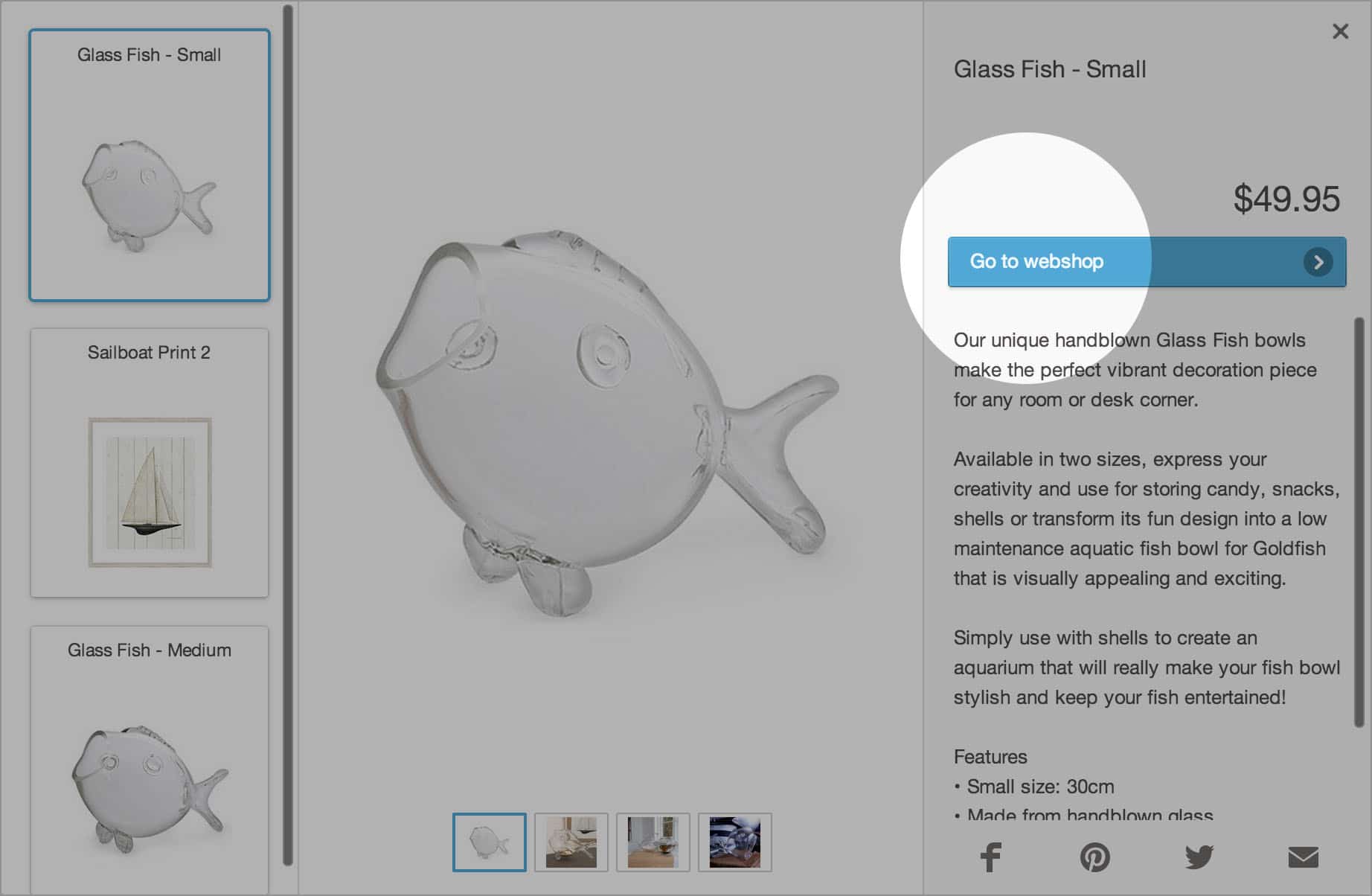
By using product hotspots, you enable your customers to receive additional product details (e.g. description, price, extra images, etc.) when they click on a product in your online catalog.
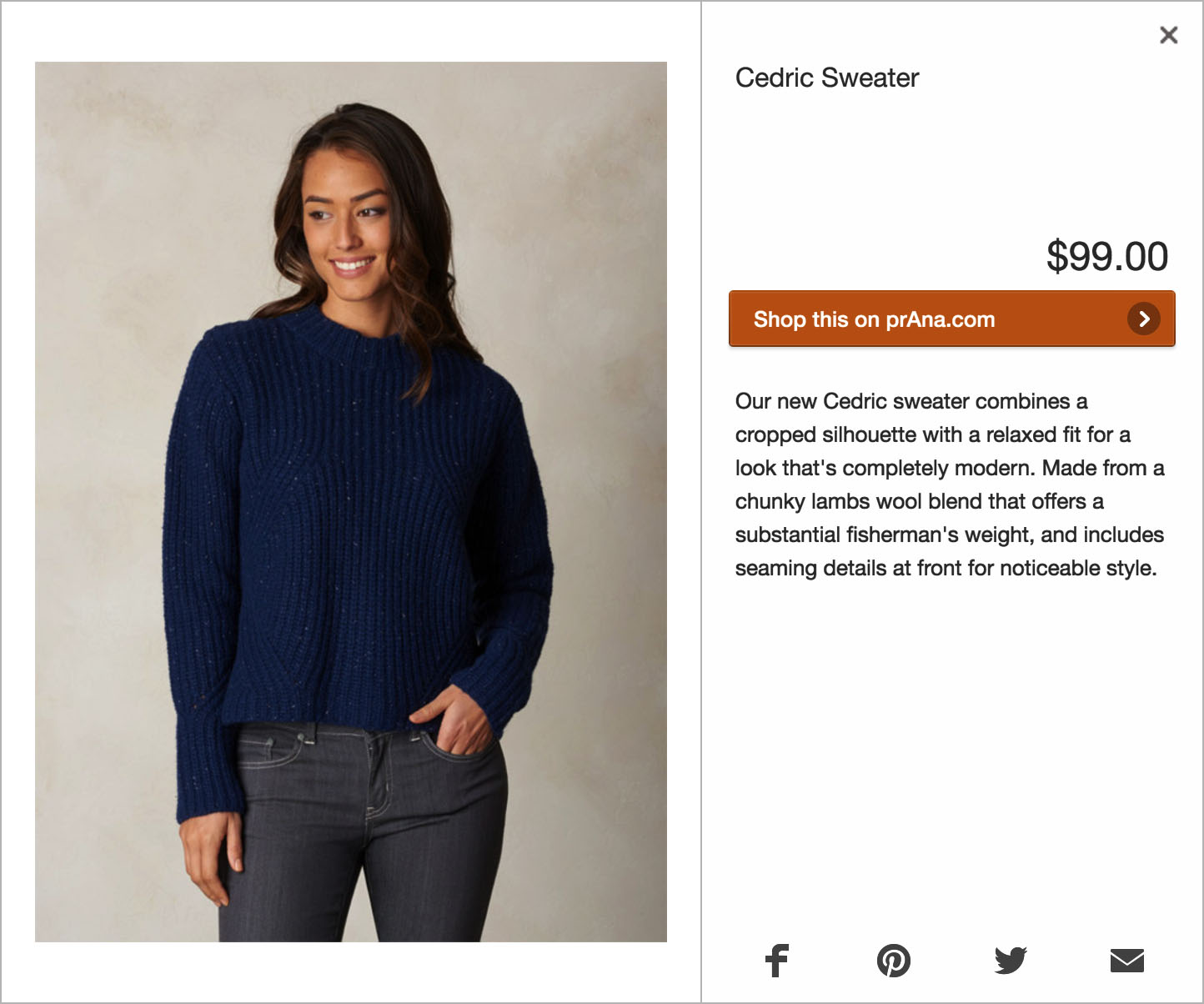
The reason why we suggest you use product hotspots instead of link hotspots is simple. With link hotspots, each click leads users away from the catalog to open your online store. This can be a really frustrating experience. With product hotspots this is not the case, as users can continue to browse your catalog and will have a more seamless experience. They can choose to go to your online store when and if they want to, this means that the traffic leading to your online store becomes much more relevant.
So what does the data tell us? We analyzed hotspot interaction rates in online catalogs, and noticed that on average, active users clicked product hotspots 12,5% more often than link hotspots. This is why we recommend to use product hotspots when making your products clickable.
Note: Product hotspots work better in most cases. However, interaction rates vary per industry. In some cases, link hotspots might deliver better results. As always, make sure to measure what works best for you.
Connect your product feed with Publitas
You can probably imagine that creating product hotspots one by one is extremely time consuming. Tagging each product would require you to add product details, product images, the link to your online store and so on. That’s why we’ve made it possible to import your online store’s product feed. Doing so will display your products in Publitas catalog creator, which allows you to simply drag products from the feed onto your catalog to automatically create a product hotspot. You can either search for the products in your feed, or you can use our detected products section to find the products you wish to tag.
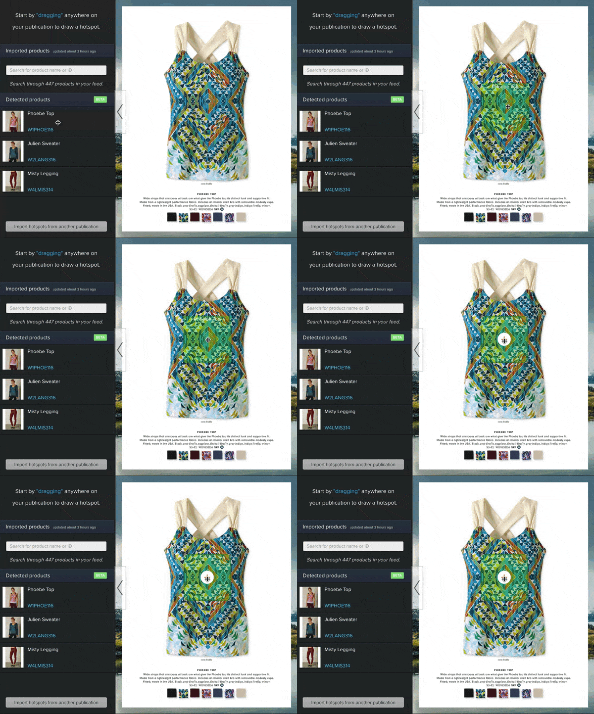
If, for whatever reason, you’re not using your product feed in Publitas, we really recommend you to look into this. It may take some time to set up, but it’s worth the investment.
By setting up the product feed and using product hotspots instead of links, you will:
- Save a lot of time
- Increase your hotspot interaction rate
- Deliver a better experience to your users
Tip #2: Include product details in the hotspot’s click area (if possible)
Whether you create a hotspot manually or drag and drop it from your imported product feed, the next step is to choose a size and position for the click area in your catalog.
When it comes to setting the click area of a hotspot, we recommend to include the product’s details, for example:
- Image
- Price
- Description
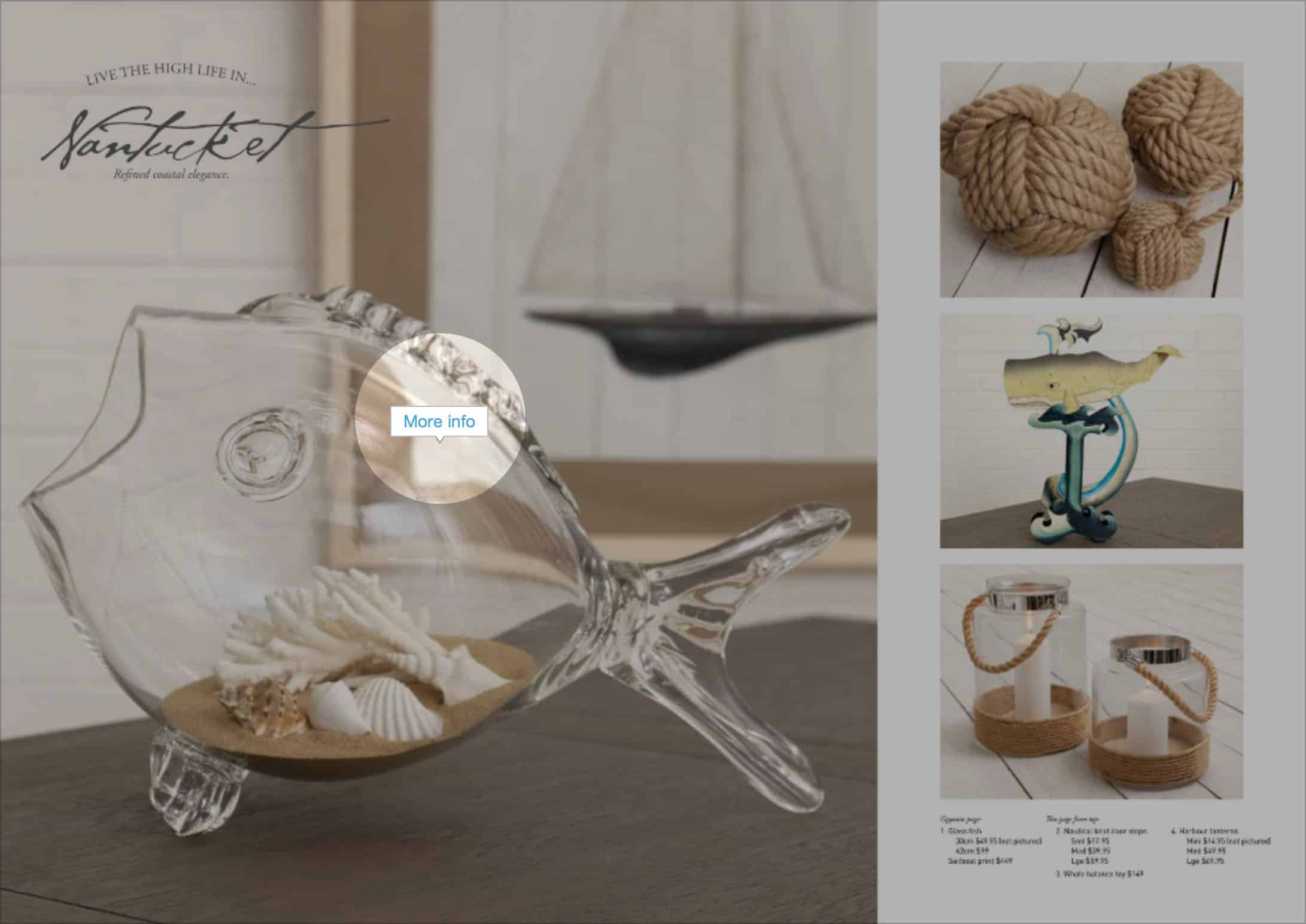
Here’s an example of a single product with a sensible click area:
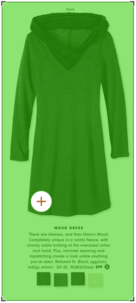
By including the product description within the click area, you make sure that when a user clicks on the description, the product overlay is opened. The product overlay offers more space for a good product description as well as including other images that could provide the user with the information they are looking for. Ultimately, this gives them a better experience than just reading the short description alone.
Tip #3: Feel free to use overlapping hotspots
The first example that we discussed is quite simple; the product fits perfectly inside a rectangle and the click area is not taking up space of another product. That’s not always the case, as your hotspots will sometimes need to overlap.
We’ll go over a few different scenarios next, but whatever the case, we just want to emphasize that there’s no need to worry about hotspots with overlapping areas. They’re not ‘bad’ and you certainly don’t have to avoid them. In short, if the situation calls for you to create overlapping hotspots, then feel free to do so.
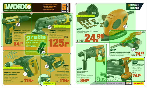
Another case where overlapping hotspots can come in handy is in a situation like this:
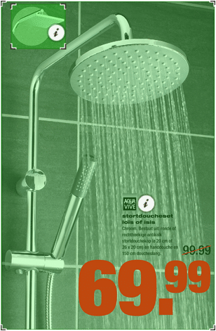
How do overlapping hotspots impact the user experience?
Publitas automatically makes sure that in most situations, your customers get to see the most relevant hotspot when they click on an overlapping area. Here’s how:
Situation 1: Hotspot icons are enabled
In this case, Publitas detects which hotspot icon is closest to the user’s mouse cursor and displays that hotspot.
![]()
Situation 2: Hotspot icons are disabled
In this case, Publitas detects which hotspot center is closest to the user’s mouse cursor and displays that hotspot.
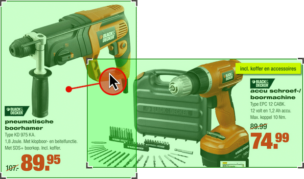
Displaying the right hotspot when icons are disabled.
Tip #4: Check for three common scenarios to tag multiple products in one hotspot
So far we’ve covered tagging products and dealing with overlapping click areas, but what about adding multiple products to a hotspot? When does this become relevant and how can you do it?
While there are probably more use cases for adding multiple products to one hotspot, three common situations where this becomes particularly useful are:
- Tagging product combinations.Think of entire outfits, outdoor furniture sets, tableware sets, and so on.
- Tagging product ranges.These are usually a range of items on sale or a group of products that are available in different sizes, colors, etc.
- Cross-selling other products.This is where you use multiple products in a hotspot to show related products, product recommendations, or to use it as a “other customers also bought” feature.
1. Tagging product combinations
This situation is probably most relevant for fashion retailers who want to create “shop-the-look” options for consumers.
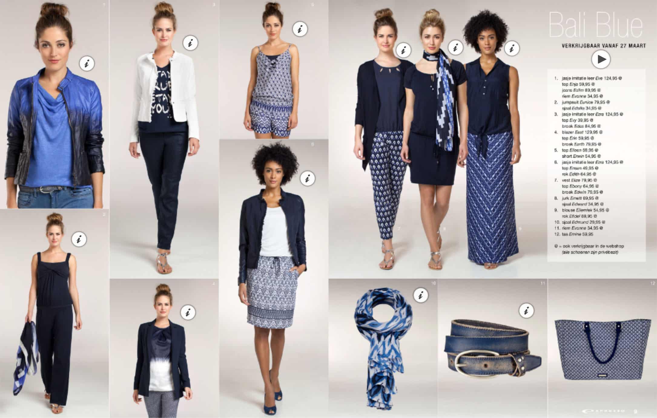
When users click on either of these outfits, they’ll get to see a nice overview with all the items that a model is wearing, as can be seen in the example below.
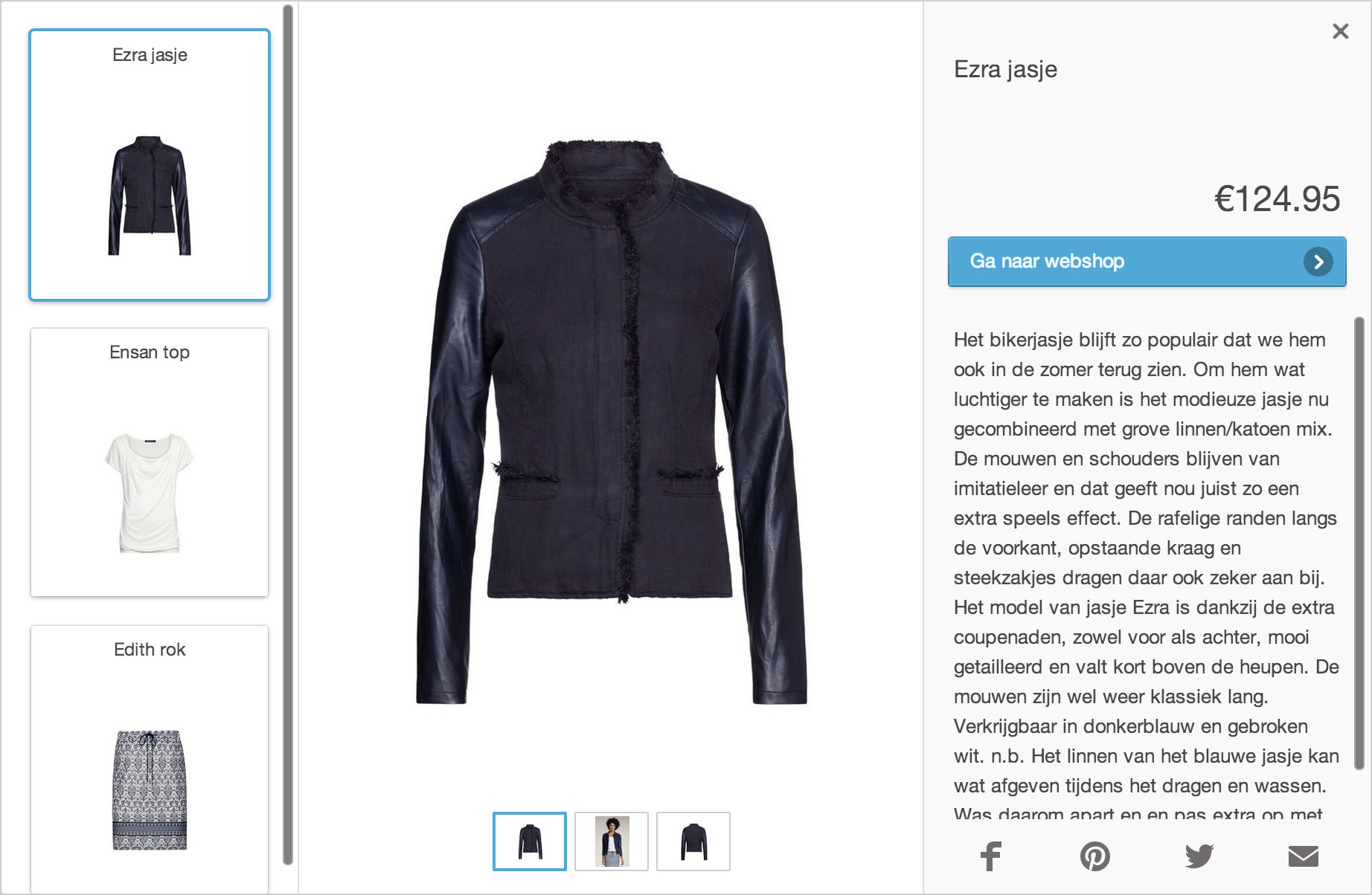
Clearly, this is a good use case for adding multiple products in one hotspot. You don’t have to create different hotspots for each item. All you do is drag the products on to an existing hotspot, and Publitas will understand you’re adding multiple products to that hotspot. This saves you a ton of time and enhances the experience for end-users.
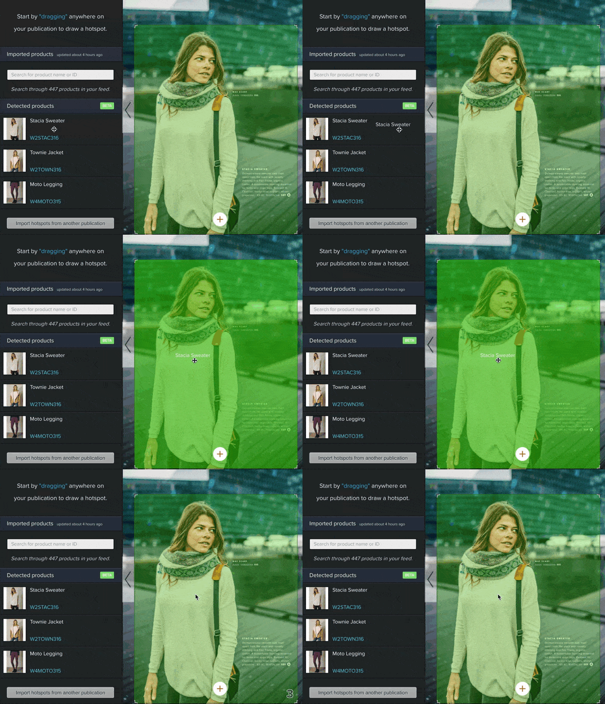
It goes without saying that the multiple product view could be useful for any combination or set of products that go together, and not just fashion items.
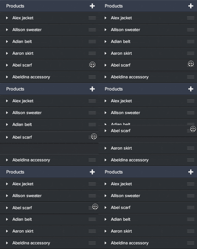
Once you’ve added all the products you want, you can also rearrange the order in which these products are presented to your customers. This is a great way to ensure the order of the product view matches the order in which the model is wearing these items. Simply select the hotspot with multiple products, and drag and drop your products in the desired order.
2. Tagging product ranges
Another reason to combine products in one hotspot is if your catalog contains a group or a range of products in a single image. Check out this example:
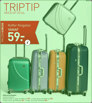
This is a great opportunity to combine products in one hotspot, and it’s in our opinion a much better alternative than tagging each item separately. It’s less work for you, there’s less visual clutter, and all the information is centralized in a single hotspot.
3. Cross-selling other products
In the two previous examples we included multiple products in one hotspot, because the click area actually included these products. With a single click users can either view an entire outfit or view all available colors of the same product. Another way you could use multiple products in one hotspot is to show your customers other products they may be interested in. For instance, you could add related products or products that are often bought together.
Here’s an example from one of our customers who used this clever technique for their digital catalogs:
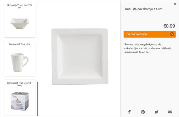
As you can see here, when a user clicks on the cake plate, they’ll also get to see a bowl, a mug, and a dishware set.
Tip #5: Turn on hotspot icons
Another key component of the hotspot is the icon. The hotspot icon is an indicator for any type of hotspot. In other words, it’s a way of letting consumers know that there’s something in the area near the icon, be it a product, link, video or a reference to another page which they can click on. Here’s what hotspot icons look like:
Before we dive into details and technicalities, the first question we need to ask is are icons even needed, and if they are, when? In the past we wrote a blog post to answer this question, which you can read here.
If you don’t want to read the full post, here’s a short answer to the question:
- If you consistently tag all the products in your online catalogs, it doesn’t really matter if you turn icons on or off—it’s up to you (we prefer to always use icons).
- If you only tag some of the products in your online catalogs, make sure you turn your icons on.
Tip #6: Follow the three rules for optimal icon placement
When it comes to positioning icons, we believe there are three simple rules to make sure your icons are always positioned in a logical way that enhances the user experience.
1. Touch the edge of a product, but don’t cover it up
It’s important to make sure the hotspot icon and its mouse-over text are placed in a logical position without obstructing or covering important details of the product. Placing the icon in the center of the product will draw attention away from the image, so try and position the icon on the edge of the product whenever possible.

Another mistake that often confuses users is floating icons. These icons are disconnected from the product they belong to, making it look like they’re just floating on the page.
![]()
2. Create sufficient space
It’s also important to make sure that icons aren’t touching or stacked on top of each other. You can do this by creating space between icons, which will avoid confusion and clarify which icon belongs to which product.
![]()
As you can see in the example above, it’s not instantly clear which icon belongs to which product. This is much clearer:
![]()
3. Be consistent
Perhaps the most important rule for positioning your icons is consistency. It’s foundational to a good user experience and also helps shoppers quickly identify which product belongs to the icon.
![]()
Here’s how not to do it:
![]()
Inconsistent icon placement.
Tip #7: Write compelling mouse-over and call-to-action texts
The mouse-over and call-to-action (C2A) texts you use for your hotspots can have a big impact on the hotspot interaction rate, and consequently your bottom line. Joanna Wiebe from Copy Hackers sums it up nicely in a post on Copyblogger:
“Visitors who don’t click don’t convert.”
Simply put, if your mouse-over texts aren’t inviting enough, visitors will be less likely to click on your products.
The same goes for the call-to-action button in your product hotspots.
“Your visitors can’t get through your checkout process without clicking at least one button,” says Joanna. “And that one button — like all of your buttons — can be improved on.”
Which is why you need to write compelling mouse-over and call-to-action texts. So how can you do that?
While there aren’t any rules set in stone for this, there are a number guidelines you can stick to when writing these texts to improve their effectiveness. Here are a few copywriting best practices we’ve compiled for you:
- Arouse curiosity. The key here is to give your visitors just enough information to click, without giving away too much to leave them curious. You can do this by coming up with mouse-over texts that explain the what, without explaining the why or how.
- Offer a benefit. In all of your copywriting, remember to ask yourself “what’s in it for my customers?” Am I saving my customers money or time? Do I make them look more stylish or smell better? As the folks over at User Onboarding said in this incredible post: “People don’t buy products; they buy better versions of themselves.” That’s so true, and there are numerous examples of companies that really understand and leverage this—and hopefully you will too.
- Create urgency. “People are extremely motivated to take action out of fear of missing out on an opportunity,” says Greg Dineo in a post about call-to-action mistakes. Another great article on urgency that’s worth checking out is The Smart Way to Create a Sense of Urgency.
- Use verbs. How often do you read headlines or call-to-action texts riddled with adjectives? The problem with relying on adjectives alone (see #5) is that they’re descriptive and don’t directly call for an action. Verbs are great way to combat this (as you’ll see in the examples below), so use them more often.
- Write in first person. There are quite a lot of examples where changing the word “your” to “my” in call-to-action buttons has led to huge boosts in conversion, so that’s something you could also experiment with. Joanna Wiebe talks about this in more detail here (see “4. Write button copy in the first person”).
Here are seven magic words you can include in your mouse-over and call-to-action texts to get more clicks:
- You, new, free, guaranteed
- Instantly (see “6. Include “power” words)
- Get
- Because
Examples of mouse-over texts you could use:
- Get the look
- New in online store
- Sale ends soon! Click here to buy.
- Shop item—free shipping for a limited time.
- Save €15 today
- [Look/smell/feel/etc.] better
Examples of call-to-action texts you could use:
- Take me to the online store
- Buy now
If you’re ready to give some of these examples a try, just log in to your Publitas account and go to Language & Branding. We explained how you can change the default mouse-over and call-to-action texts in an earlier post, so have a look that. It’s also possible to change a hotspot’s mouse-over text individually without altering the default mouse-over text that you’ve set in Language & Branding. You can do this by filling out the field ‘Hotspot mouse-over text’ in the Editor (more on that here). This way you can give different products a different mouse-over text. Pretty awesome huh?
It’s important to keep in mind that everyone’s situation is different. What works for someone else may not work for you. The main takeaway is to:
- Define what you’re optimizing for (clicks, revenue, something else?)
- Test different mouse-over and call-to-action texts
- Measure and analyze the results
This way you’ll learn what works for your business and how you can make the most out of your digital catalogs.
Tip #8: Save time using keyboard shortcuts in the hotspot editor
We’ve added a few keyboard shortcuts that can greatly increase the speed at which you can tag products with hotspots:
- Arrow Keys – Move selected hotspot(s) by 1 px.
- Arrow Keys + Shift – Move selected hotspot(s) by 10 px.
- Ctrl-C & Ctrl-V (or Cmd-C & Cmd-V) – Copy and paste the currently selected hotspot(s).
- Spacebar – Anytime you press the spacebar, you’ll immediately activate and focus on the search field of the product feed. This allows you to quickly search for the product you’d like to add.
- Cmd / Shift + Click – Add the clicked hotspot to your selection. This allows you to select multiple hotspots.
- Cmd / Shift + Drag – Draw a rectangle to select all the hotspots within it.
- Up & down arrow keys – Select a product from the search results in your product feed. The selected product is highlighted.
- Enter – Confirm actions such as adding the highlighted product to the currently selected hotspot.
- Backspace / Delete – Delete currently selected hotspot(s).
- Escape – Deselect the current hotspot.
The most common uses for these shortcuts include:
- After creating a new product hotspot, immediately press space to search and use the arrow keys to select a product. Press enter to add that product to the hotspot.
- After adding a product to a hotspot, easily add another (or multiple) product(s) to a hotspot by pressing space to reveal your search results again.
A final word
We hope this guide will help you get more out of your online catalogs while offering your customers an all-round better experience. If you enjoyed this post you may also like:
