
How Gamma Tested and Improved the ROI of Their Digital Brochure
Location: NL
Industry: Hardware / DIY
Website: https://www.gamma.nl/

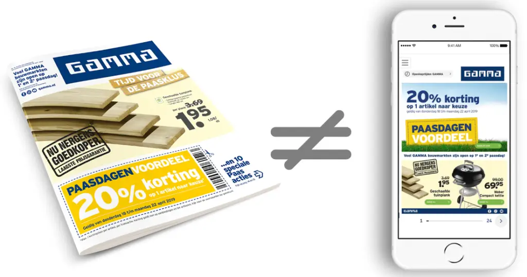
Dutch hardware retailer GAMMA knows adjusting their brochure for online use would cost time and money…but would it be worth it? They decided to test their theory that making adjustments for the digital space would pay off in terms of ROI because:
- Reading a digital leaflet online is a different experience from reading it offline
- The ROI of their webshop conversions was already very high (and boosted by their digital leaflets)
- Digital leaflets are becoming more critical and popular
Here’s how they tested the ROI of their digital brochure — and you can too!
Start with the benchmark
Before testing improvements, you must know your brochure’s current performance. GAMMA started by measuring the traffic and turnover generated in its online store through its digital leaflet. They did not change the brochure’s layout yet; they only added links for measurement purposes.
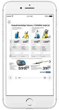
Online Grid — adjusting and testing the layout
The reading experience in a digital leaflet differs from the physical version—readers tend to skim and skip online content more quickly. When designing a digital brochure, it must be done so that readers can see offers at a glance. The space on a mobile screen is limited, so it has to be optimized.
GAMMA adjusted the layout of its brochure by using what we call an Online Grid:
- A mobile-friendly format
- Only including the price and title of the product
- Using one product image per listing
- CTA buttons
- Deletion of smaller text
- Footers
A/B Testing
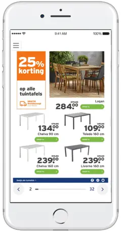
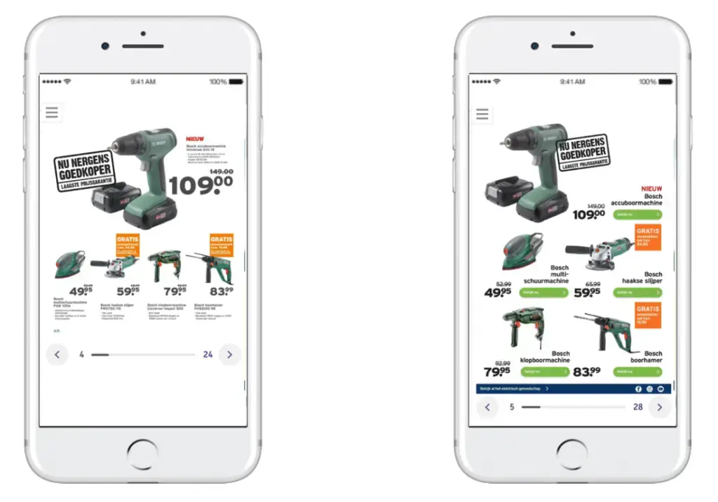
During the A/B test, the optimized and non-optimized versions went live simultaneously. There was also no difference in content, which allows for a pure performance comparison of the layout of both versions.
Result
After several A/B tests and measurements, GAMMA was able to take stock. During the evaluation, GAMMA also included the webshop’s conversion data alongside the digital leaflet’s performance. The result?
Because of the positive ROI, they were able to make a case for optimizing their brochures using an Online Grid.
If you think your company can benefit from similar customer solutions please contact our Enterprise Team.
