Hover states have been with us since the invention of the mouse, and for good reason—they tell users where to click. So, when A.S. Watson asked us to improve the hover states of their hotspots, we immediately set out to work.
During a period of two months, we ran several A/B tests where we made their hotspots visible on hover. In doing so, we were able to achieve a 96% increase in their click-through rate (CTR—i.e. the ratio of shoppers that click from the online weekly ads to the online store).
We’re delighted to finally make this update available for everyone. Read on to learn more about the update and how you can make use of these benefits.
Before we dive in, I’d like to give a quick overview of this post. The first section explains the hotspot hover state and how you can enable the feature. It also includes some tips on how to use the hover state to its fullest.
The second and third sections are for those that are interested in reading more about the tests we performed and our theory as to why the improved hover states led to such a significant improvement.
1. Hotspots visible on hover
Most of you are probably familiar with the hotspot editor and how you can use rectangles to create clickable areas (or hotspots) in your online catalog.
In the past, when a shopper would hover over a hotspot, their mouse cursor would change and a tooltip would appear:

There is no indication of the clickable area, which results in unclarity of what the user is about to click. To solve that, we’ve made it possible to show the hotspot when shoppers hover their mouse over it:

By enabling this feature, you’re giving shoppers more precise feedback of what they’re going to click. And in the case of A.S. Watson, this improved their CTR by 96%.
While we can’t guarantee this improvement for everyone, we highly advise you to enable and test this feature for yourself.
How to make hotspots visible on hover
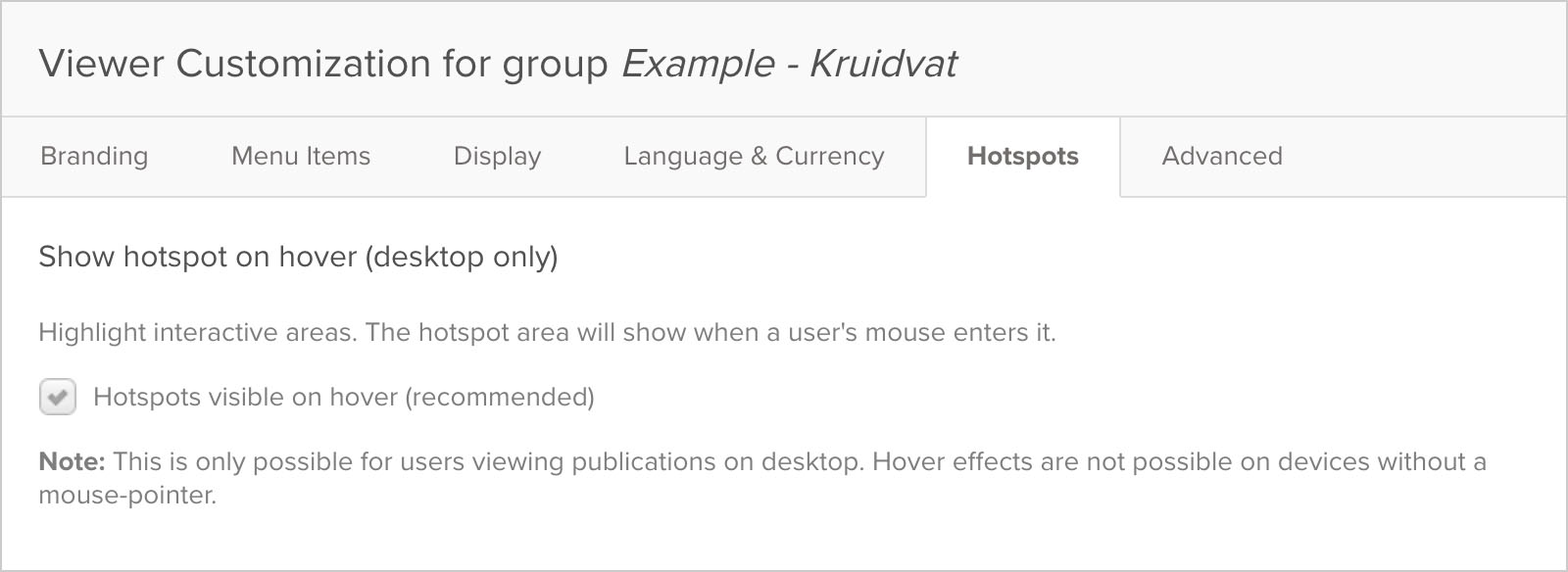
Hotspots visible on hover is automatically enabled for any new groups you create. For existing groups you’ll have to enable it by going to Viewer Customization -> Hotspots -> Hotspot visible on hover.

What to keep in mind when activating the hotspot hover state?
- By activating this feature, you’re making the hotspots visible on hover for all the catalogs in your group. This includes catalogs that are currently online. It might be wise to review those catalogs to make sure the hotspots are correctly positioned and looking good.
- While the hover state helps to reveal the click area of a hotspot, it is not an excuse to disable hotspot icons. Hotspot icons still serve a unique purpose, as they indicate where the hotspots are.
- Hover states don’t work on smartphones and tablets. Another reason to keep hotspot icons enabled.
Bonus Tip:
- To get the best result from the hotspot hover state, your hotspots should be properly placed. We’ve written a guide on how to tag products with hotspots to help you improve your hotspot placement.
2. A/B test A.S. Watson
When we make changes to Publitas catalog creator, we want to make sure we deliver value to you and your customers. So, to verify the value of having hotspots that are visible on hover, we ran two tests. The first was an A/B test on a weekly ad that ran for 7 days:
| Test group | % increased CTR |
|---|---|
| A – Control group | – |
| B – Improved hotspot hover state | 99% |
With the first test we achieved a 99% increase in CTR—much higher than we expected. As these results were very promising, we decided to do another test. The second test ran for 21 days:
| Test group | % increased CTR |
|---|---|
| A – Control group | – |
| B – Improved hotspot hover state | 96% |
Again the test had much better results than we expected, confirming the validity of the first test results. We also tried a few different interaction models, such as briefly flashing hotspots right after a page had loaded. None of these had noteworthy increases in CTR compared to the hotspots that are visible on hover.
3. How did hover states lead to such a significant improvement?
Without a healthy dose of mind-reading, it is rather difficult to pin down specifics. However, a quick glance at Don Norman’s usability heuristics gives us a few clues—a friendly reminder to never forget the fundamentals of UX and usability!
Our UX specialist Oliver McGough has pulled out the 4 points which indicate why hover states are so essential:
1. Visibility of system status
“The system should always keep users informed about what is going on, through appropriate feedback within reasonable time.”
Before the introduction of hover states, we left it up to the user to assume clickable areas. The only prompt was a small hotspot icon and a tooltip on hover.
We didn’t want to cover our customers’ beautiful catalogs in clickable hotspots, fearful that encroaching on their design would annoy them and their readers.
Without clear evidence of what is clickable, why would shoppers click?
2. Error prevention
“Even better than good error messages is a careful design which prevents a problem from occurring in the first place. Either eliminate error-prone conditions or check for them and present users with a confirmation option before they commit to the action.”
Hover states are an amazing way to confirm an action before the user commits to it. As the mouse hovers over a hotspot, the user is informed about the click area and that something will happen when they click.
Users are now able to distinguish which clicks will result in which actions and they can decide to click or not. In the past, our users would have to click blindly, potentially clicking somewhere they didn’t want to.
3. Recognition rather than recall
“Minimize the user’s memory load by making objects, actions, and options visible. The user should not have to remember information from one part of the dialogue to another. Instructions for use of the system should be visible or easily retrievable whenever appropriate.”
As with Error Prevention, hover states act as a visible indicator of what will happen. In UX design, we want to leave as little as possible open to interpretation.
We want efficient and subtle actions which do not impede on the larger experience. Efficiencies keep the user’s mental load thinking “I could imagine myself buying this” rather than “what do I do next?”.
Usability is removing mental load from way-finding through the experience. Freeing up more capacity for enjoyment of the experience. Hover states make clicking and way-finding that much more instinctual.
4. Aesthetic and minimalist design
“Dialogues should not contain information which is irrelevant or rarely needed. Every extra unit of information in a dialogue competes with the relevant units of information and diminishes their relative visibility.”
Finally, hover states are an excellent example of minimalist design. We convey all the information we need to through a small opacity tweak. Pictures may tell a thousand words, but our subtle hover state is telling at least two—”CLICK HERE”.

