We always go to great lengths to ensure your online publications are beautifully displayed and that they use as much screen space as possible. Based on the feedback that you have given us, we’ve added a few options that can improve how you display your publications.
More about Single Page View
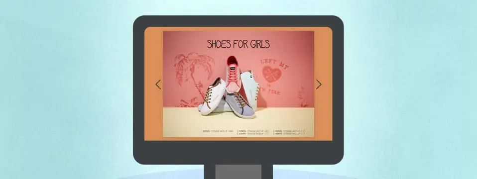
Single page view allows you to create publications that show one page at a time instead of showing spreads (two pages). This feature is especially useful for publications that are landscape oriented. Take a look at the image below to see how showing a single landscape page can greatly increase the user experience compared to showing a spread.

There are a few other cases where the single page view can improve the user’s experience:
- Your publication has a small number of pages (eg. 1 – 6 pages)
- Your publication is designed with single page view in mind
How to create a single-page publication
You can choose between a Single or a Booklet (spreads) during the creation process of your publication.

This means you can’t switch between Single or Booklet after you’ve uploaded and converted your PDF. Any existing publications that you wish to publish as a Single Page publications will need to be recreated.
Fit or fill your content on mobile devices
Sometimes a publication looks best when using as much space as possible. Other times it’s essential to make sure your publication neatly fits within your reader’s display. We’ve added an option that allows you to choose the display method that best suits your publication.

Fitting content within the display
This method scales your content down so that it fits the display of your reader’s device. With this option, you make sure your entire page or spread is immediately visible. We advise you to use this method when using single page view, or when your content has square/landscape shaped pages.

Filling the available space of the display with content
This method makes sure the entire display is used, however, this could result in your content getting cropped off at the sides. We advise you to use this method when your pages are portrait oriented and closely resemble A4 size.
To switch between the two mobile display methods, simply navigate to Viewer Customization -> Display.

