Share article
Whether you’re planning a handout for an event, a service overview for new customers, or an educational leaflet for a waiting room, the question is usually the same: what is a pamphlet, and what does it need to include to work?
This guide covers what is a pamphlet, what belongs on the page, and a practical seven-step process for building one, from blank page to finished piece.
What Is a Pamphlet?
A pamphlet is a short, unbound publication built to inform, educate, promote, or raise awareness around one focused topic. Most consist of a single sheet or a handful of folded panels, which keeps the message narrow and the reader’s next step obvious.
Businesses, schools, healthcare providers, and community groups use pamphlets to explain a service, promote an event, walk a reader through a process, or make a quick case for something.
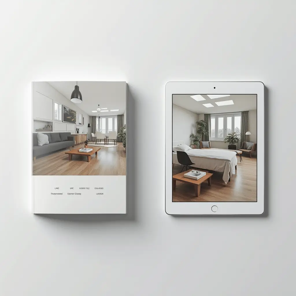
A pamphlet can be printed and handed out at a counter, table, or event, or it can be published digitally as a PDF or an online version. The content requirements stay largely the same either way; the format just decides how the reader accesses it.
What Goes in a Pamphlet?
A pamphlet works when four elements are doing their job: a clear headline, supporting information the reader actually needs, visuals that clarify rather than decorate, and a way to act on what they just read.
Headline and Main Message
The headline names the subject at a glance, and the opening line or two states the core message before any supporting detail follows. A reader should understand what the pamphlet is about and why it applies to them within a few seconds, without needing to scan the rest of the panel first.
Supporting Information
What belongs here depends entirely on purpose. An event pamphlet needs date, time, and location. A product pamphlet needs key benefits and specifications. An educational pamphlet needs the facts a reader actually requires to make a decision or take an action. The test for every line is relevance, not volume. A pamphlet that tries to cover everything ends up communicating nothing clearly.
Images and Visual Elements
Photos, illustrations, icons, and simple charts should support the message, not fill space. Eye-tracking research from Nielsen Norman Group shows that most readers scan a new page rather than reading it line by line, and that clear headings and imagery largely determine where they slow down to pay attention.
A pamphlet with a strong visual hierarchy makes the key information easier to identify than one that’s simply full.
Branding, Contact Details, and Call to Action (CTA)
Close with the practical information a reader needs to follow through: logo and brand identity where relevant, a phone number, address, website, or QR code, and one specific action: call, visit, register, or buy.
A pamphlet without a clear next step leaves the reader informed but not moved.
How to Make a Pamphlet in 7 steps
Once you know what a pamphlet is meant to accomplish, how to make a pamphlet that works is mostly a matter of following a consistent workflow, step by step, regardless of topic or format.
1. Define the Purpose and Audience
Start with the outcome, not the design. What should someone do after reading this pamphlet, and who exactly are they? A trade show handout and a hospital waiting room leaflet call for different vocabulary, different lengths, and often different formats entirely, even when the underlying goal stays the same.
2. Outline and Prioritize the Content
Before opening a design tool, write down every fact, benefit, or instruction that could plausibly belong, then remove anything unnecessary. Anything that doesn’t move the reader toward the pamphlet’s one goal gets dropped at this stage, not during layout, where deleting text usually means redoing the whole page.
3. Choose the Format and Structure
A single sheet works for one clear message. A bi-fold or tri-fold adds panels for a process with a few distinct steps, and a small booklet suits denser topics that genuinely need the room. Pick the format based on how much content survived step two, not the reverse.
4. Write the Copy
With the outline set, write toward it: a headline that names the topic, short paragraphs a reader can skim, bullets only where a list genuinely beats a sentence, and language a stranger would understand on first read. Anything that doesn’t contribute to the main objective gets cut here too.
5. Build the Design
Lay the copy, images, type, and branding into a sequence that guides the eye where it needs to go next. Canva, Microsoft Word, and Google Docs are suitable for creating many types of pamphlets; dedicated design software isn’t always required.
6. Proofread and Test
Read it again for typos, wrong dates, and dead or mistyped links and QR codes before it goes to print. For a printed piece, a physical test copy catches sizing, color, and fold problems that never show up on a screen.
7. Print or Publish Your Pamphlet
At this point, the design splits into two paths. A physical pamphlet goes to print for handouts, mailers, or in-store distribution. A digital pamphlet uses the same design, exported as a PDF.
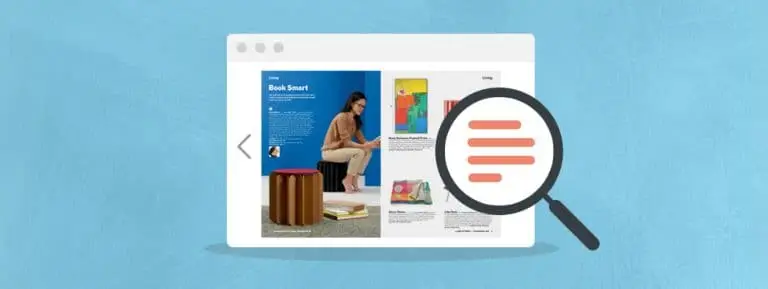
A flat PDF forces readers to zoom and scroll. Platforms like Publitas can turn that same PDF into an interactive online publication, with clickable links and built-in analytics, without a full redesign.
Common Pamphlet Mistakes to Avoid
Most pamphlet problems come down to trying to say too much in too little space. Before finalizing a design, check for:
- Overcrowding: cramming in every possible detail instead of the few points that matter.
- Weak visual hierarchy: no clear order for the eye to follow from headline to CTA.
- Poor-quality images: blurry, stretched, or low-resolution visuals that undercut credibility.
- Inconsistent formatting: mismatched fonts, spacing, or colors across panels.
- Difficult-to-read text: type that’s too small, too dense, or set against a busy background.
- Missing CTAs or contact details: a pamphlet that never tells the reader what to do next.
- Unchecked errors: typos, wrong dates, or outdated contact information that erode trust.
Pamphlet Examples and Ideas
Pamphlets take different shapes depending on what they’re built to do. These four pamphlet examples illustrate common business and organizational uses:
- Educational pamphlets explain a topic, process, or condition in accessible language, such as a healthcare provider outlining a treatment option or a nonprofit explaining a policy issue.
- Event pamphlets cover date, time, location, and schedule, along with what attendees should expect, often paired with a registration or RSVP prompt.
- Promotional pamphlets highlight a product or service’s key benefits, pricing, or a limited-time offer, built around a single conversion action.
- Awareness pamphlets raise visibility around a cause, issue, or public health topic, usually pairing a clear message with resources or next steps for the reader.
Pamphlet vs. Brochure: What’s the Difference?
The pamphlet vs. brochure question comes down to purpose, format, and information density rather than appearance, since the two can look nearly identical side by side. A pamphlet is typically a single sheet or small folded piece built around one focused message.
A brochure usually carries more panels or pages and more product or service detail, often supporting a longer sales or decision-making process. In general, a short publication focused on one message may be described as a pamphlet, while a brochure often presents more detailed information across multiple panels or pages.
FAQs About Pamphlets
What is the difference between a pamphlet and a flyer?
A flyer is typically a single unfolded sheet built around one short message, while a pamphlet can be folded into multiple panels and cover a bit more ground. Both prioritize a quick read over depth.
What type of paper is best for printing a pamphlet?
A heavier stock can work well for pamphlets that will be handled frequently, while lighter stock may suit short-term handouts or mailers. Choose the weight and finish based on durability, folding, readability, and printing requirements.
How much text should a pamphlet have?
There’s no fixed word count. The content should be concise enough to scan quickly while still answering the reader’s essential questions.
Should a pamphlet be single-sided or double-sided?
Single-sided works for a short, single-message pamphlet meant for a quick glance. Double-sided suits pamphlets with more supporting detail, since it adds space without adding panels or print cost.
How do you distribute a pamphlet effectively?
Match the channel to the audience: hand it out at events or relevant locations, include it with mailers, or share the digital pamphlet through a website, email, or social post for readers who won’t encounter the physical piece. Choose the distribution method based on where your audience is most likely to encounter and use the information.
Enjoyed this article?
Get the next one straight to your inbox.