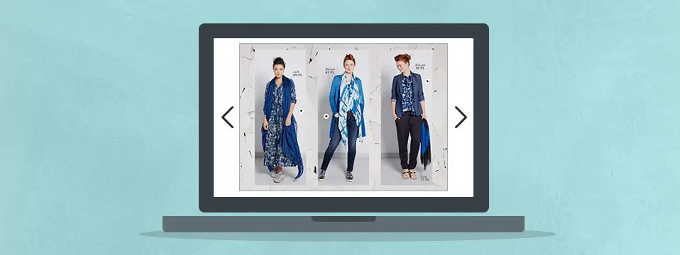
It’s been almost a year since we released the single page feature. With hundreds of publications published by our users every day, we’d love to share how some people are using the single page feature to create a beautiful experience for their readers. Be sure to read on as we present a beautiful example and explain why horizontal single page publications work.
Check out this publication by Katch Silva as posted on her blog.
We really like how this publication makes use of the single-page feature with horizontal pages. When looking at the embedded publication, you can immediately see that the available space is fully used. This is not the case with a booklet publication where the cover page does not fit as nicely. The single page publications are also easy to read through, as each page has a single topic or focus. When viewing these publications full screen on the most commonly used resolutions (see table below), the experience makes good use of the entire screen.
Why horizontal single pages are a good alternative for viewing publications on the Internet
The majority of the publications created with Publitas are portrait catalogs or magazines. This makes sense, as these are one-on-one conversions from the original print version. We believe that horizontal pages can be a good alternative as the most common displays today have a ratio of 16:9 (or 9:16 when held upright). This goes for desktops, laptops and smartphones. Have a look at this table featuring the most commonly used resolutions by our readers:
| Resolution | Ratio |
|---|---|
| 1366 x 768 | 16:9 |
| 360 x 640 | 9:16 |
| 768 x 1024 | 3:4 |
| 1920 x 1080 | 16:9 |
| 1280 x 800 | 16:10 |
| 1600 x 900 | 16:9 |

Looking at the table and the image above, it makes a lot of sense to use horizontal pages for viewing publications on the internet. So, for your next online-only publication, we invite you to design a wide, horizontal publication with a 16:9 ratio.

