Digital lookbook design best practices determine whether a lookbook becomes a productive discovery channel or a static asset with limited impact. Senior ecommerce and marketing leaders no longer view lookbooks as optional inspiration galleries, but as structured, measurable discovery flows that reduce distance to products and strengthen shopping pathways.
This article distills evidence-based learnings from UX research, performance guidelines, shopper behavior, and operational imperatives that retail teams can apply to improve product discovery, conversion, and long-term scalability.
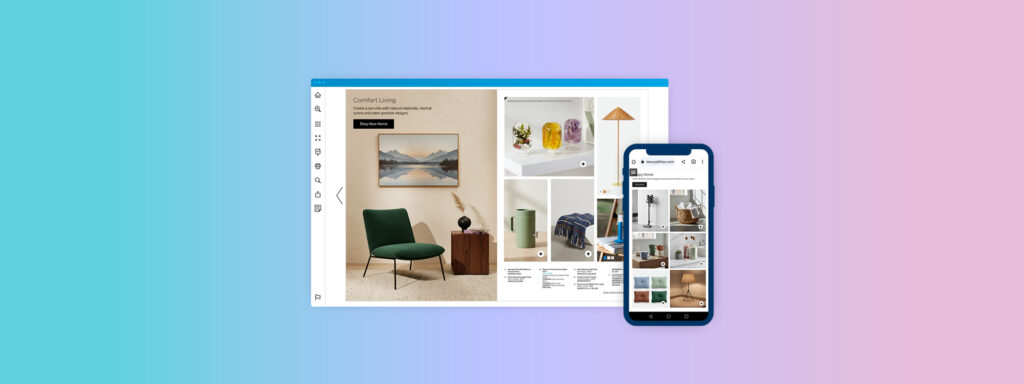
What Is a Lookbook?
In modern retail, a lookbook is a curated sequence of visuals and product context representing a collection or theme. It blends inspiration with product discovery. Unlike static catalogs, digital lookbooks should embed interactive elements that support evaluation and guide shoppers toward product-specific pages with minimal friction.
Why Do Digital Lookbooks Matter in Modern Retail?
Digital lookbooks matter because they fill a gap between high-level inspiration and product detail. When designed correctly, they offer structured browse and evaluation paths, facilitate rapid context switching, and surface product options at key decision points.
Mobile devices account for a substantial share of e-commerce visits. Baymard research shows that poorly optimized navigation and touchscreen friction account for frequent drop-off in category and product discovery. Lookbooks that ignore real browsing patterns on mobile risk underutilization. Conversely, lookbooks that reflect thumb reach zones, predictable hierarchy, and accessible interactions support faster scanning and evaluation.
Lookbooks also provide discrete, sequence-based signals, where shoppers paused, tapped, or exited, enabling teams to refine content, hierarchy, and product emphasis. This behavior data closes the gap between creative intent and shopper response.
Core Principles of Effective Digital Lookbook Design
Effective digital lookbook design starts with decision support. Apply digital lookbook guidelines that standardize: where product identifiers appear, how hotspots look, and how shoppers move between pages.
Add governance: define approval rules (brand, merchandising, legal) so every lookbook ships with the same interaction standards and fewer last-minute edits.
Prioritize Visual Hierarchy for Faster Evaluation
Use a repeatable hierarchy: hero image → product marker → essentials (name, price, key variant) → action. Consistent placement reduces re-learning costs page to page.
Treat hierarchy as a design system component so teams can reuse patterns across categories without rethinking layout logic each season.
Build Mobile-First Layouts That Reflect Real Browsing Behaviors
Design for thumb reach and tap accuracy. Use fewer focal points, larger interactive targets, and predictable next/previous controls; avoid collage spreads that collapse on small screens.
Validate on real devices and slower networks, because “looks fine on desktop” often hides tap friction and scroll fatigue on mobile.
Use High-Resolution Images and Videos Without Slowing Performance
The largest visual asset on a lookbook page often becomes the Largest Contentful Paint element. Google’s Core Web Vitals targets, including LCP within 2.5 seconds, low Cumulative Layout Shift, and responsive interaction measured by Interaction to Next Paint, make visual delivery an operational requirement. Use responsive image sizes, modern compression formats, and lazy loading for offscreen pages to preserve performance.
In addition to static imagery, short-form video can support inspiration and evaluation within digital lookbooks. Lightweight product or lifestyle videos communicate movement, texture, fit, and use-case context that static imagery cannot fully convey, particularly in fashion, home, and lifestyle categories. When implemented correctly, video supports storytelling without interrupting product discovery.
Performance governance remains critical. Video elements should be selectively placed, muted by default, and optimized for fast start times using poster frames, adaptive delivery, and deferred loading. Treat video as a performance-sensitive component, and evaluate its impact on page load, interaction responsiveness, and scroll behavior.
Pair visual quality assurance with performance quality assurance. Measure Core Web Vitals at the template level, including pages that contain video, so creative enhancements do not degrade browsing speed, interaction reliability, or discovery depth over time.
Maintain Brand Consistency Across Collections
Keep typography, marker style, and caption rules stable across drops so scanning patterns transfer between releases. Consistency also reduces production overhead by limiting bespoke exceptions, which improves speed-to-publish and lowers QA risk.
Designing Lookbooks for Product Discovery and Conversion
Best practices for digital lookbook design focus on distance-to-product: the fewer steps from inspiration to PDP, the more likely the journey continues. These practices should appear in every template, not only in flagship campaigns.
Make Lookbooks Shoppable Without Interrupting Flow
Prefer tap-to-reveal hotspots or product cards over permanent overlays. Product cards should include only what supports the next action: name, price, and a direct PDP link.
Shorten Navigation Paths Between Inspiration and Products
Provide two paths: (1) inline hotspots for “I want this,” and (2) a “shop the collection” index for list-oriented shoppers. Track hotspot taps, product card opens, and outbound clicks; GA4 integration supports cross-channel comparison.
Use Story-Driven Sequencing to Reflect Shopper Intent
Sequence for evaluation, not narrative: start with category and price boundaries, move to key use cases, then finish with add-ons.
Content Structure and Layout Techniques That Modern Lookbooks Use
Effective lookbooks use a disciplined set of page types. This limits cognitive load and ensures each page serves a purpose. Teams should define a small, repeatable set of structural templates (overview, comparison, spotlight) and apply them across collections.
Limiting variability also strengthens analytics: similar page types across releases allow for meaningful benchmarking.
Give Every Page a Clear Purpose
Intentional page design is mandatory. An overview page should orient shoppers: what is the collection, and where does it sit in the broader assortment? A comparison page should highlight relative differences: materials, features, and variants. A spotlight page should resolve uncertainty with focused context and pricing details.
Pages that do not serve a clear decision role should be reconsidered. Unnecessary pages create noise that dilutes interaction signals and adds friction to the evaluation path.
Provide Skimmable Captions, Labels, and Context
Captions and labels are not decorative; they are decision support. Shoppers rarely read long paragraphs. Instead, they scan concise, well-structured captions that present key information: product name, one clear differentiator (material, fit, or performance attribute), price, and key variants. This pattern reduces cognitive load and supports predictable eye movement across pages.
Design for Accessibility and Inclusiveness
Accessibility is an operational requirement, not a compliance afterthought. Interactive elements must be keyboard accessible, have visible focus indicators, and meet WCAG contrast standards. Alternative text for images ensures usability for assistive technologies. Inclusively designed lookbooks expand reach and reduce bounce rates among users with diverse interaction needs.
Operational Best Practices for Managing Digital Lookbooks at Scale
Reduce Manual Work by Standardizing Lookbook Templates
Treat templates as governance, not convenience. Define a locked system for typography, spacing, hotspot style, and caption structure, so teams spend time on merchandising decisions, not reformatting every spread.
Ensure Every Lookbook Stays Current Across Channels
Stale pricing, broken PDP links, and unavailable SKUs erode trust fast. Use product feed integration to keep identifiers, URLs, pricing, and availability aligned with the source catalog, so updates propagate without page-by-page edits.
Leverage Data to Inform Future Lookbook Designs
Instrument lookbooks like any other performance asset: track page depth, hotspot taps, product card opens, and outbound clicks to PDPs. Use GA4 with cross-domain measurement so journeys from lookbook to site aren’t split into separate sessions, then iterate on low-performing pages and sequences.
Where Publitas Fits In?
Publitas fits when teams need a controlled, measurable production system for digital-first lookbooks: reusable page templates, interactive elements like hotspots and product cards, product feed support (XML/TSV), and GA4-based measurement with cross-domain setup guidance.
Common Mistakes to Avoid in Digital Lookbook Design
- Desktop-first spreads that collapse on mobile: Dense layouts, small tap targets, and unpredictable swipe patterns increase exits and reduce product clicks.
- Hotspots without clear product identifiers: If shoppers can’t immediately tell what’s clickable (or what product a marker represents), they stop exploring.
- Heavy imagery that hurts performance: Oversized hero assets often degrade LCP/INP and slow page-to-page browsing, reducing overall discovery depth.
- Broken or indirect paths to PDPs: Extra steps (or inconsistent landing pages) add friction and weaken attribution for lookbook-driven sessions.
- Accessibility gaps in interactive elements: Missing focus states, low contrast, or non-keyboard-friendly controls exclude users and create avoidable usability failures.
How Better Lookbook Design Strengthens the Overall Marketing System?
A better lookbook design strengthens the marketing system by producing comparable discovery data across campaigns.
With standardized page templates, product markers, and shoppable hotspots, every launch can be evaluated on the same funnel signals: page exits, hotspot taps, product-card opens, PDP clicks, and device split. That makes A/B tests on sequencing, captions, and hotspot density defensible, and it reduces rework because email, paid, and onsite all point to one maintained asset.
Frequently Asked Questions
What makes a digital lookbook effective?
An effective digital lookbook helps shoppers evaluate options quickly and provides predictable pathways to product detail. Follow digital lookbook guidelines that establish a clear hierarchy, shoppable elements, and interaction measurement.
How many pages should a digital lookbook include?
Include enough pages to cover the collection and needed comparisons without repetition. Use analytics to identify where interaction density declines and trim pages that receive negligible engagement.
Should digital lookbooks be shoppable?
Yes, shoppability should be integrated in ways that reduce steps between inspiration and PDPs. Hotspots and product cards with direct PDP links preserve context and reduce bounce.
How often should brands update their lookbooks?
Update lookbooks on collection cadence and whenever critical product attributes (price, availability, PDP paths) change. Feed integration systems enable frequent refreshes with minimal manual effort.
What metrics should teams track to measure lookbook performance?
Track views, time on page, hotspot taps, product card opens, outbound PDP clicks, and conversions attributed to lookbook interactions. Additionally, monitor Core Web Vitals, Largest Contentful Paint, Interaction to Next Paint, and Cumulative Layout Shift, to ensure performance is not undermining discovery.