Catalog Design: Many of today’s catalogs have undergone a shift to align more with 21st century design and inspirational marketing. These catalogs are employed as top-of-funnel resource to drive online or offline purchases later down the line. About 70% of shoppers agree that the catalog stimulates online purchases, and “quality catalog design promotes approximately twice as much web page browsing at a company’s site”.
With that in mind, I plowed through all the recently uploaded catalogs on our platform to discover the latest catalog design trends. I also selected some of the most beautiful examples to share in this post. Read on to learn about the latest trends and find some design inspiration.
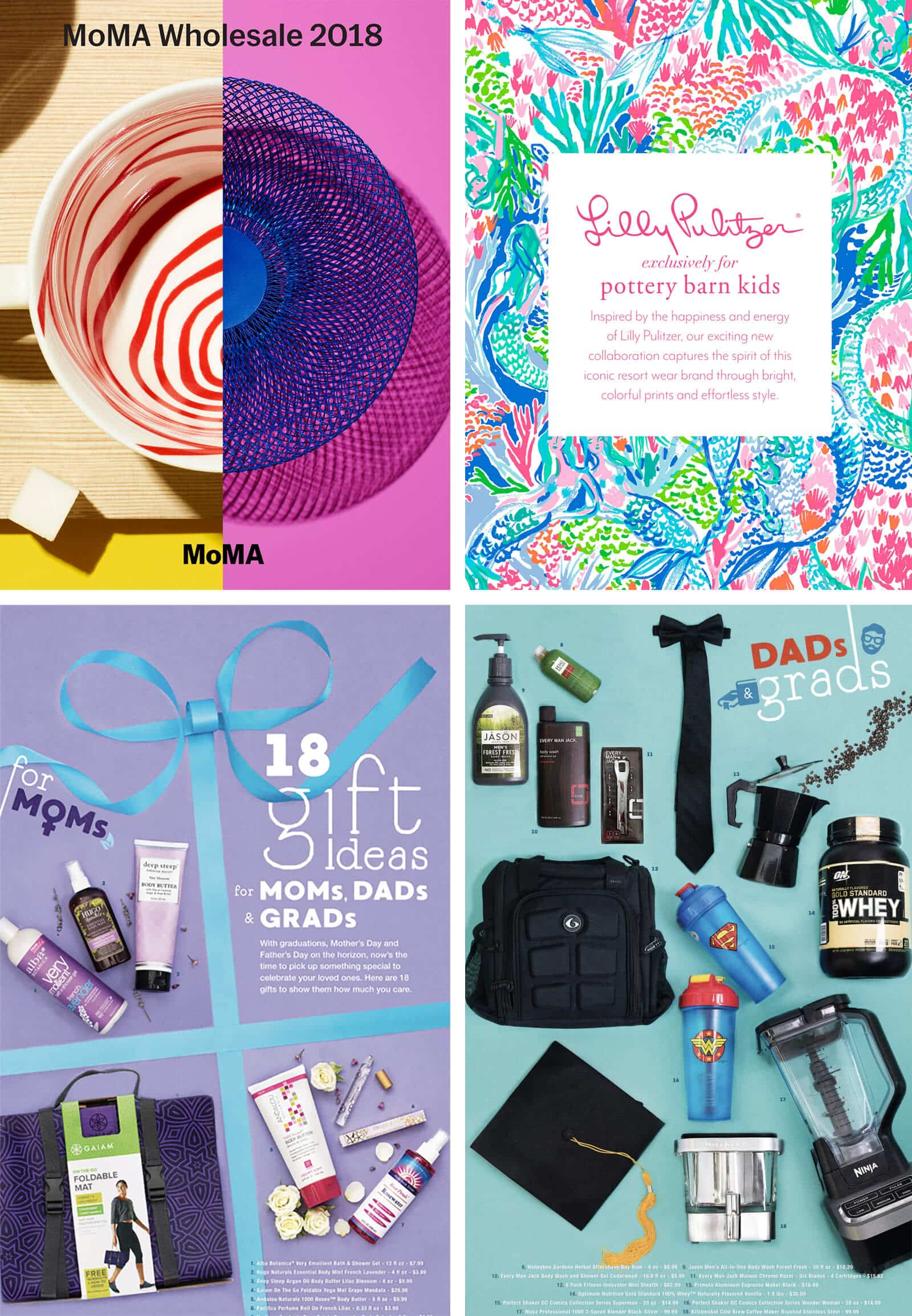
Trend #1: Daring & vibrant colors
Many of our customers experiment with vibrant and unconventional color combinations. This trend is visible in illustrations, graphics and photography. Even product pages—that are predominantly white—are more often seen with a colorful background.
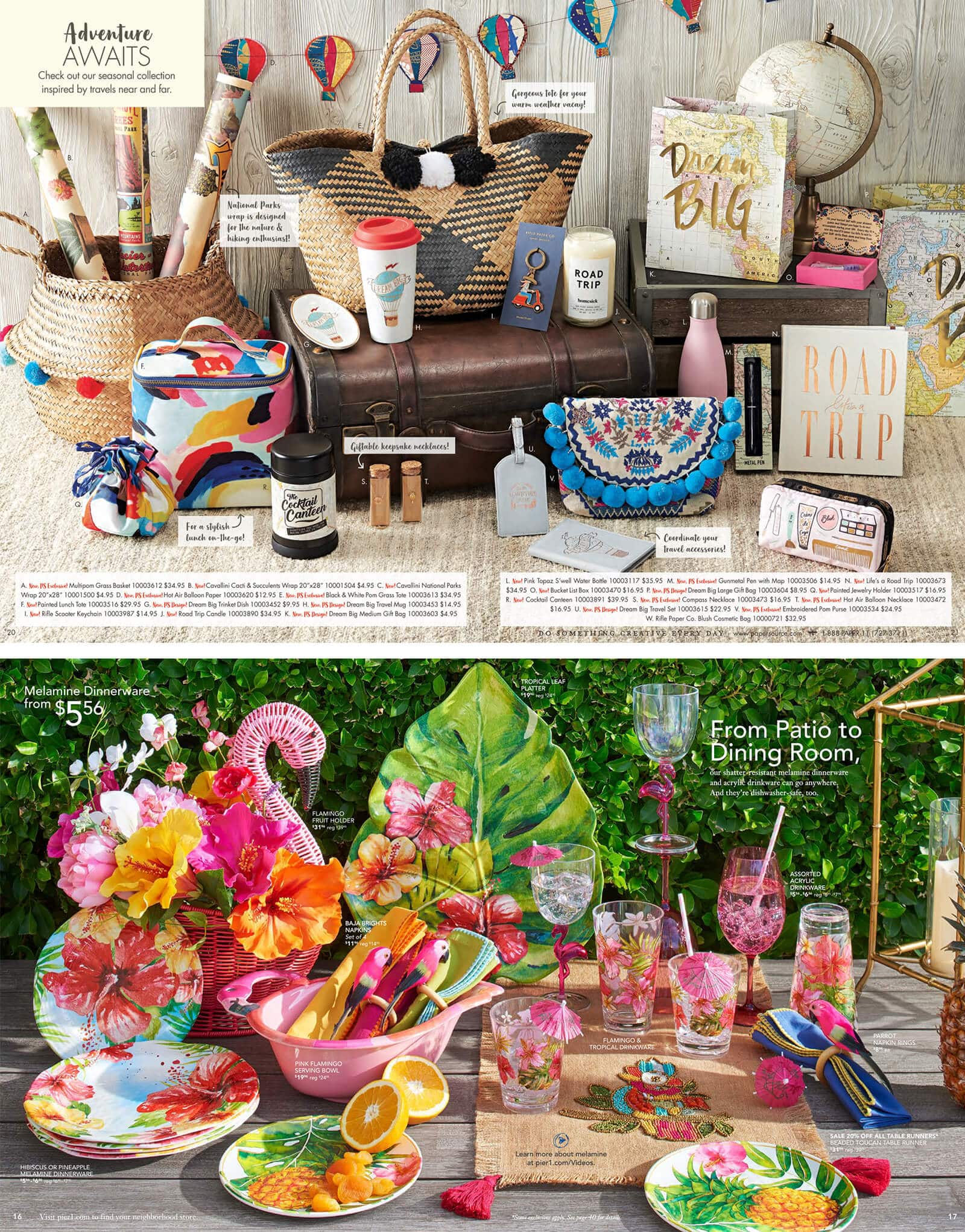
Trend #2: Modern still life
To make product pages more lifelike, many of our customers are using what I would call “the modern still life”. Products are arranged in a beautiful way to create photos that are much more interesting than a plain grid of products.
The still life does not necessarily place products in an authentic context, but seeing products arranged this way creates a more memorable, enjoyable and unique experience.
Trend #3: ‘Nouveaux’ flat
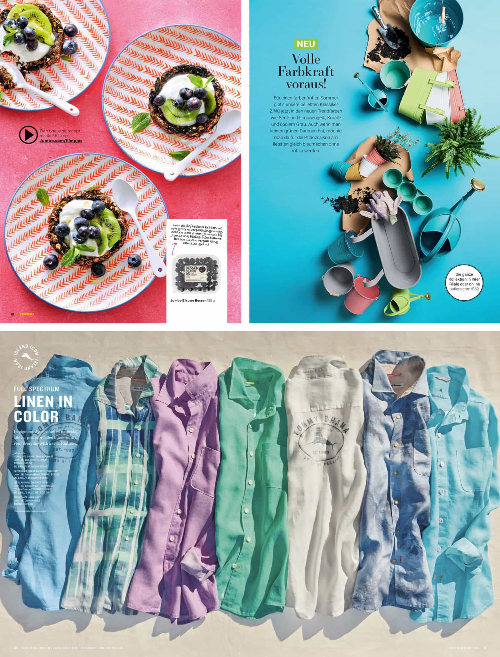
Flat and material design have been a huge hype the last few years. What caught my attention in recent catalogs is that the concept of flat design is still present, but enhanced in various ways. Things just have a little bit more ‘depth’.
Single colored backgrounds are still very popular, but often more texturised than before. There is a resurgence in subtle use of gradients and flat design is combined with elements of reality. Product curation on flat backgrounds—especially with a bird’s-eye view—has beautiful results and serves as a way to make product pages more intriguing. Finally, photography that emulates principles of flat design adds a fresh look to many of our customer’s catalogs.
Trend #4: Reality fuses with illustration
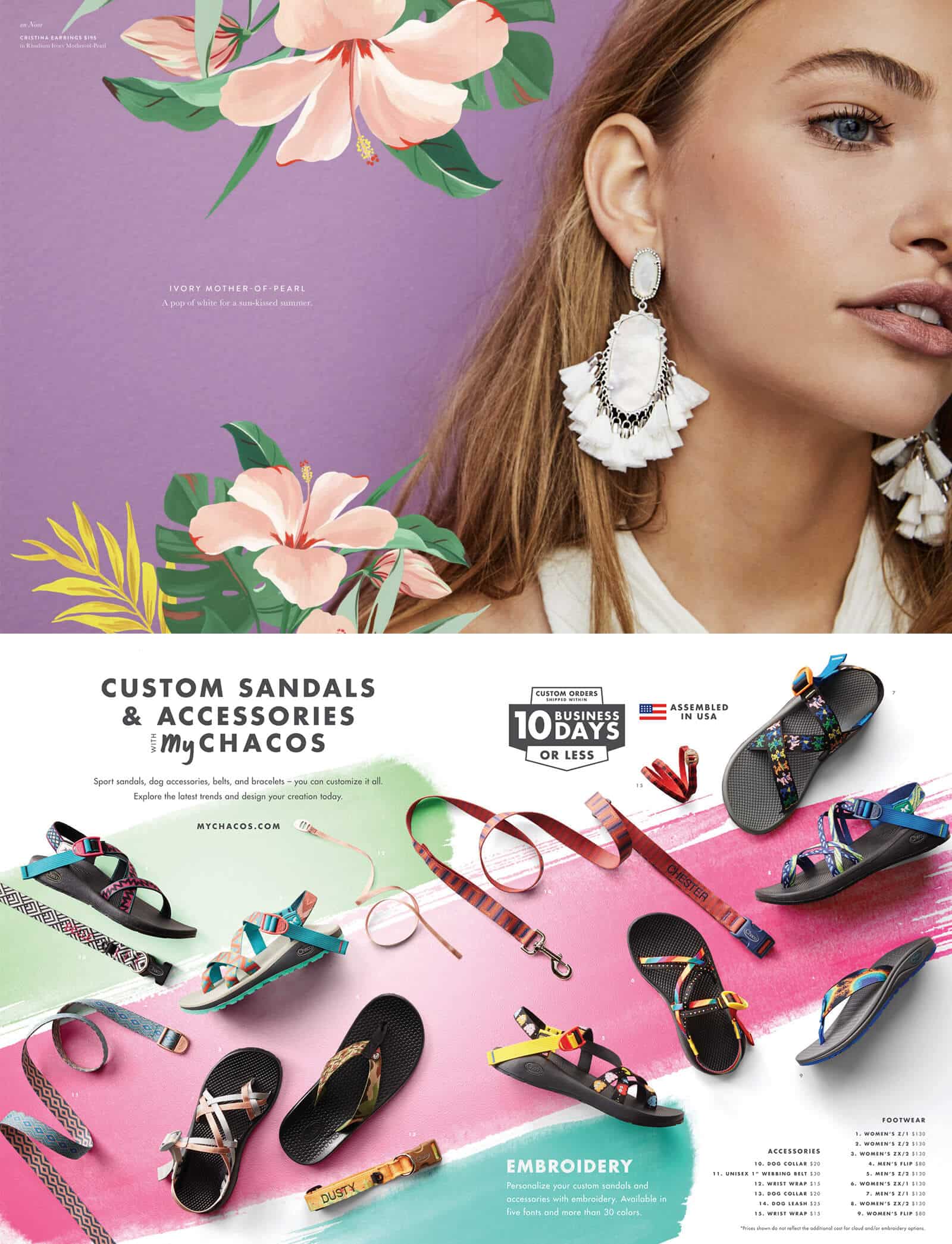
To add a bit more ‘spice’ to your photography, have a look at this trend. Many illustrative elements are used to decorate photos or product pages. Interaction between products, fonts and photography is also used to create interesting new atmospheres.
In short, a playful way of looking at photography, fonts and illustration seems to be more popular this year.
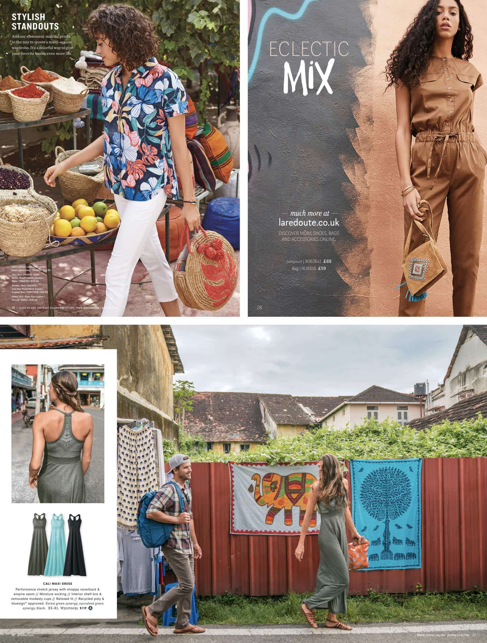
Trend #5: Multilocalism
Travel photography has been huge the last few years. This trend still continues, but with a bigger focus on people, culture and intimate or interesting locations. As described by Adobe: “We’ll explore how artists and brands are embracing a mosaic of cultural experiences, and addressing consumers’ deepening global consciousness.”
Typical mountains and beaches are replaced by more interesting and unique locations that capture local culture.
Trend #6: More authentic photography
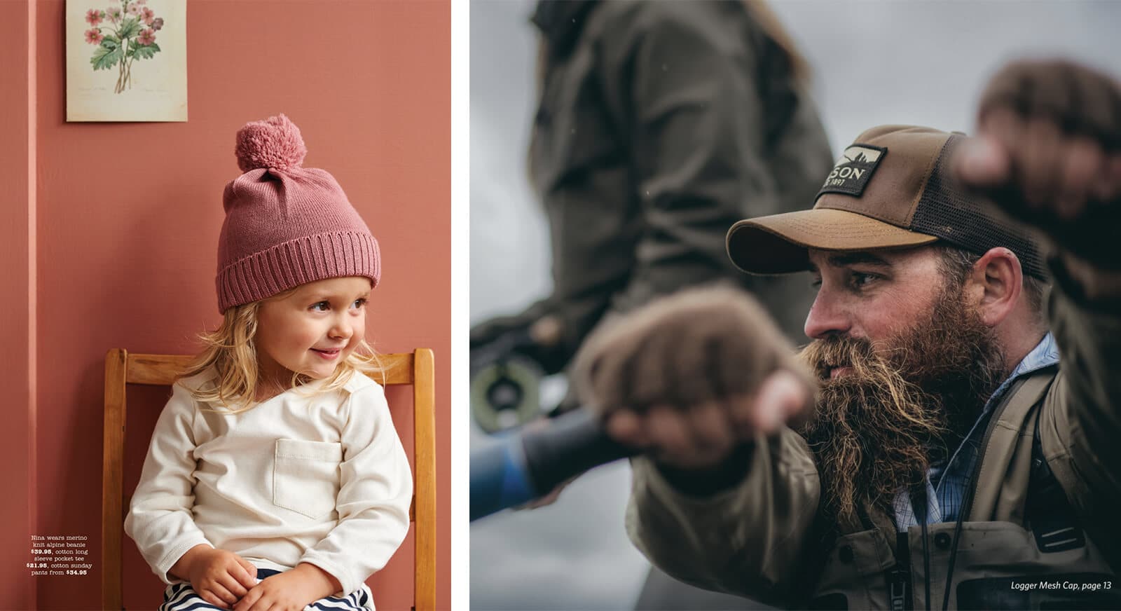
Many of the above trends are about making design more vibrant, playful, and even a bit utopic or surreal. Searching through recent catalogs I’ve seen a fair share of pictures where those same keywords could apply. When done correctly, those hyper vibrant and utopic photos do look amazing, but I’d like to share another trend I’ve also seen: an increase in popularity and quality of photography that feels more ‘earthy’ and authentic.
Looking at these photos, they look more real. The color palette is toned down, and there is less focus on the product or the model’s pose. The goal is to capture a natural emotion, moment or experience.
Trend #7: Imitated hand-drawn feel
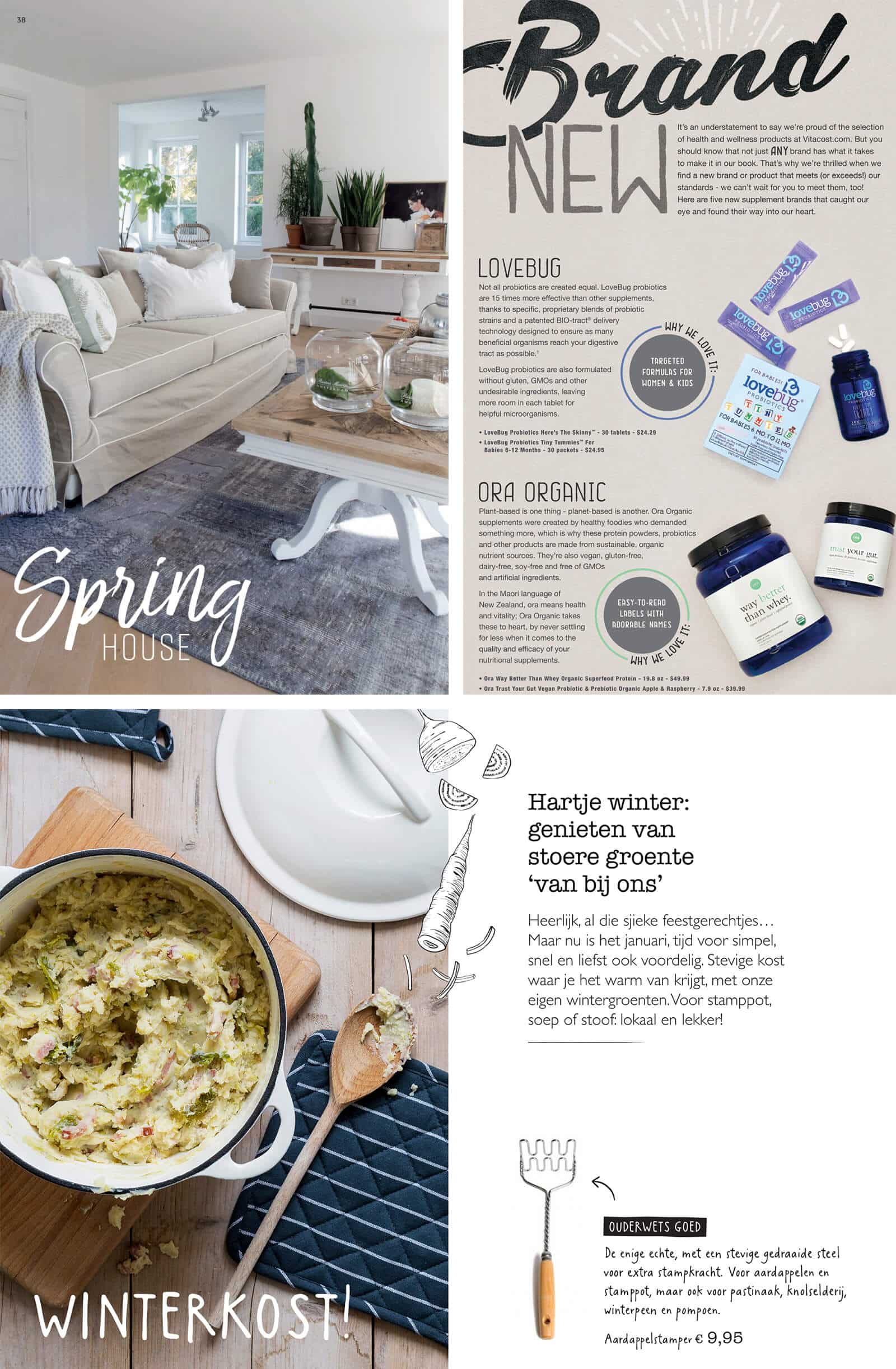
While the hand-drawn feel has been making appearances every now and then, 2018 really looks like the year where it has taken off. I see many fonts being used with a more artistic or hand-drawn look, as well as small hand-drawn illustrations added to catalogs on many places. Especially when a catalog has multiple sections, those sections are often announced through bold fonts with an artistic style. Important is not to overdo it—just a small touch here and there.
The hand-drawn look seems to fit in with the more playful design elements that are now popular. Mayhaps the last few years of material and flat design have awoken the need for something more ‘cosy’.
Keep experimenting
That wraps up what stood out to me this year. By no means do these trends cover all of the great designs I’ve seen in the many catalogs I went through, so I want to emphasize that trends are just that—trends. Always keep experimenting 🙂


